Hi everyone! It’s finally February, which means that spring is on the horizon, which means I’m slowly changing my Instagram theme from fall/winter, to spring/summer colors (aka red, green, and twinkle lights, to rainbows, beach scenes, and polka dot swimwear) – I’ve been loving the way my Instagram looks lately, and wanted to share some pointers (including some apps that definitely help me out)!
- First things first, one way to make an Instagram stand out is to be conscious of photo quality. I’ve been using a combination of my Canon Rebel T3i camera (actually a camera I bought my Mom for her birthday years ago that she’s still too nervous to use), a Sony a6000 mirrorless camera (actually a camera I bought Darren for Christmas that I borrow sometimes,) and an iPhone X.
- Next, every time I post a picture, I try to make sure that it incorporates one of the colors from my last photo. So from fall to Christmas, I tried to always incorporate an amber color, and sometimes a pop of red, you’ll also notice a lot of twinkle lights…
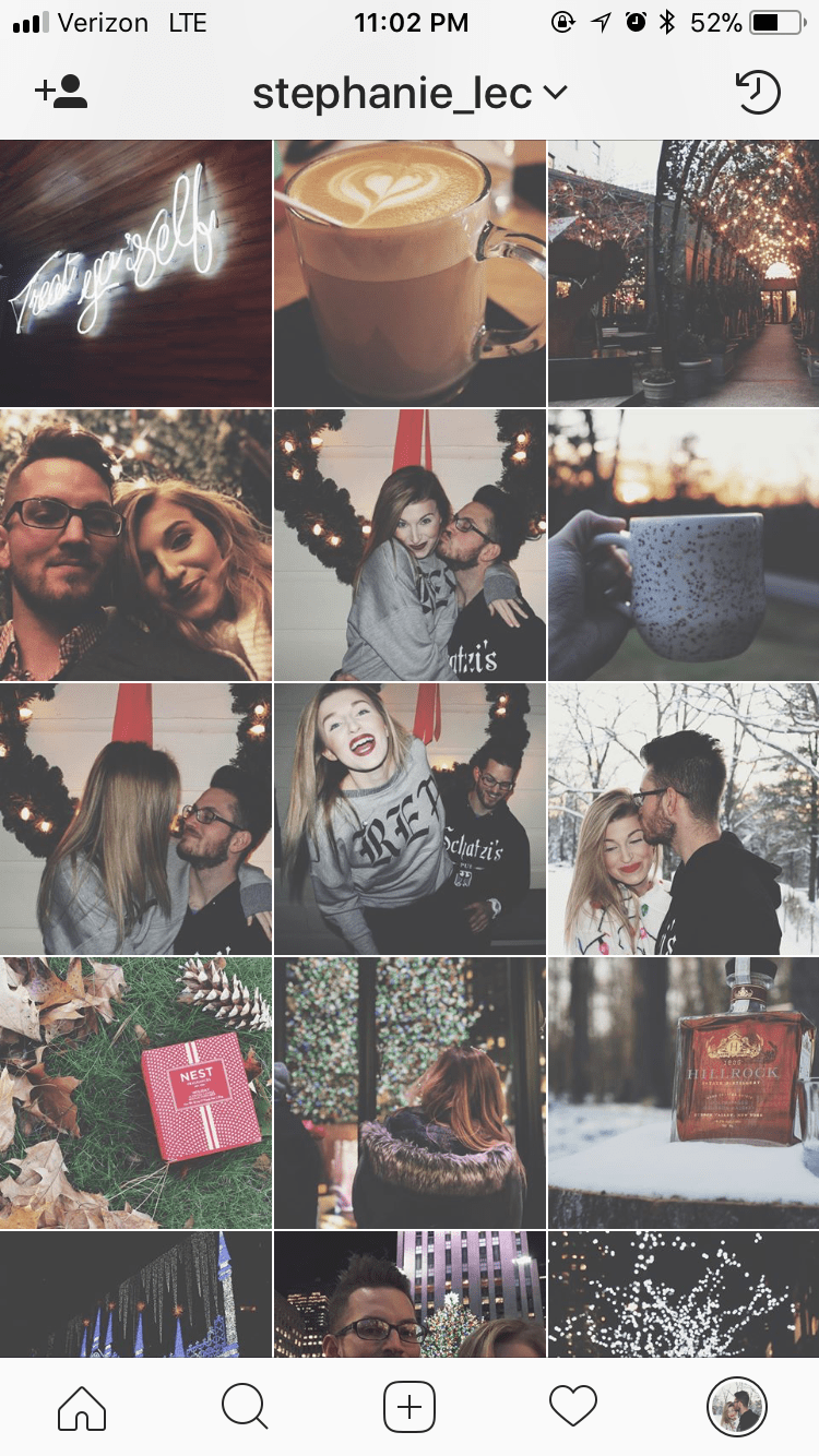 Now that spring is on the horizon, I’m slowly switching the color scheme, from reds, ambers, and fairy lights, to rainbow colors that will help me get ready for spring and summer colors. Again, next time I post a photo, I’ll just try to make sure it incorporates a color from the last one, which should be easy, since my last picture had EVERY color!
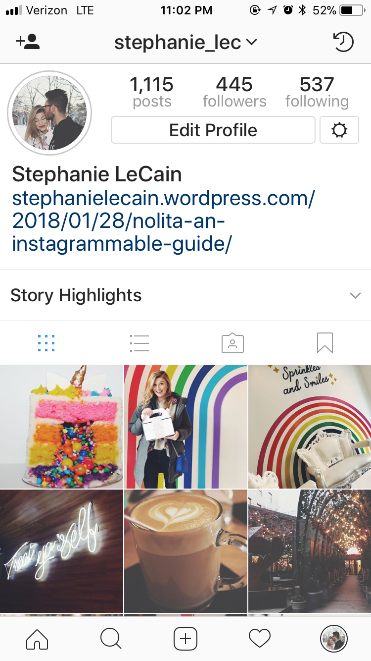
- Okay, okay, let’s get into the real reason we all use Insta, the filters! SO, another way that I keep my “theme” on track is selecting the same filter over and over again, except… I don’t use the filters built into Instagram or the ones on my phone’s camera…I use an app called VSCO! This app has more filters to choose from, and in general I like the tones they use a bit better! For all of my fall/winter photos I used “T1” and for my spring/summer photos I’ll be using “F2.” VSCO is another photo sharing app that you can find your friends on and share photos, although I don’t really use it that way. As an example, here is a picture I took when Darren and I visited the Egg Shop in Nolita, which I wrote about here, and below after I applied the filter…

 T1 makes photos feel cozier and warmer, whereas F2 pulls out the brighter bits.
 - Now that I started blogging, I’ve also been using Canva, which is basically an app where you can layer your photos with pre made templates that add really professional looking text. I really like this app because the templates already have text styles and color schemes that look professionally created! I’ll add text to a photo and then post it to my story on Instagram to let people know that I posted on here! I am always v impressed with the way it looks, and feel like a real life blogger when I look at these!

 Anyway! Thanks for reading, and good luck creating your theme, if you’re looking for inspiration follow me on Instagram @stephanie_lec

One Comment Add yours